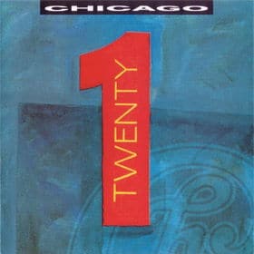
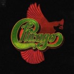
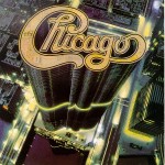
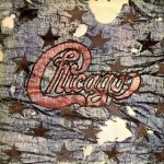
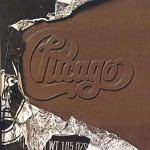
This week, The Gap renounced its plans for rolling out a new logo, mainly due to a massive social media uprising in opposition to the change. And I thought, really? There are that many people that personally invested in a clothing manufacturer’s corporate identity that they would so passionately oppose a logo change? Corporate identities change all the time. Who cares, right? But I turned it around on myself. Wasn’t there a part of me that thought the cover art of Chicago’s 1991 album Chicago 21 delegitimized the record? You may recall (but you probably don’t unless you are a serious Chicago fanatic, of which I believe there are painfully few) that Chicago 21 (or Twenty 1, as it were) marked the first time where the band’s logo didn’t appear on the cover. Okay, so you saw the upper left corner of the logo in the blue background, but the only place the word “Chicago” appeared was in generic block lettering across the top. Fail.
Chicago certainly didn’t invent the notion of a band logo, and theirs may not even be the best. The prog-rockers and hair metal bands of the 70s and 80s may be most responsible for turning the band logo into an art unto itself. It’s hard to hear the words Def Leppard or Metallica without picturing the band’s logo. Moreover, current bands like Cake and Weezer, whose members probably graffitied the hell out of their own high school notebooks with KISS logos, have taken the perpetuation of their own band logos very seriously.
Also, even though we often think of metal bands when we think about band logos, it’s generally true that logos know no genre. Like the logos of Chicago and Kansas, ABBA’s mirror-imaged block lettering is a registered trademark. Air Supply’s, though less consistently used, is a flamboyantly calligraphic woosh that pretty precisely represents the band’s musical mission. Similarly mission-oriented (however musically opposite) is the confrontational stencil lettering and crosshairs graphic of Public Enemy.
Still, there may be no other band that has gotten as much mileage out of a single band logo as Chicago has. You sorta have to admire the logo’s tenacity. And if the Chicago 21 experience proves anything, it’s that there are some brands you just don’t mess with. Learn from it, Gap.

